“Filmmunity Extravaganza” is a movie theatre chain that’s been rebranded from Cineplex. Other than a movie chain known for showing movies, they also have entertainment such as arcade and food. The rebranded logo resembles a projector emitting light; the idea is that this is how most movies are normally projected, so this idea was used to indicate that this is a movie joint and helps people to remember the brand. The brand envisions that they want everyone to be happy at our cinema and when they leave our cinema and has a target mission on having the theatres accessible to everyone and anyone, no matter what kind of disability they have.
Grey and yellow are the two primary colors used for the logo. White is a secondary color, as it is barely used. Grey represents the feel of the cinema joint in a way that there’s a neutral mood to it, since grey is a neutral color, and it balances well with the yellow of the logo. Yellow represents the light that’s being emitted from the projector as well as showing as a vibrant, happy color so patrons can feel welcome and comfortable.
Here, are the ideas on how the logo came to be. Because this is a cinema joint, I wanted to incorporate cinema related objects in the logo to symbolize the brand's occupation and have something for people to remember. When brainstorming my ideas, I love to expand my creativity, so I decided to play around with the GESTALT principles to make my logo look pleasing and unique from other brands. In addition, I also wanted to experiment with basic geometric shapes and polygons to resemble the letters "F" and "E" in some sort of way as well as using cinema related objects to help people associate the brand with the cinema, as mentioned earlier.
These pages are the guidelines for the Brand. The pages and several design elements were made through Adobe InDesign and the rebranded logo itself and some imagery were created in Adobe Illustrator with the pen tool. It was challenging in a way that I had to figure out how I can make good grid layouts for each page so I can achieve good hierarchy as well as eligibility and appealing visuals for ease on the viewers' eyes.
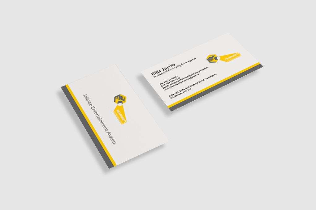
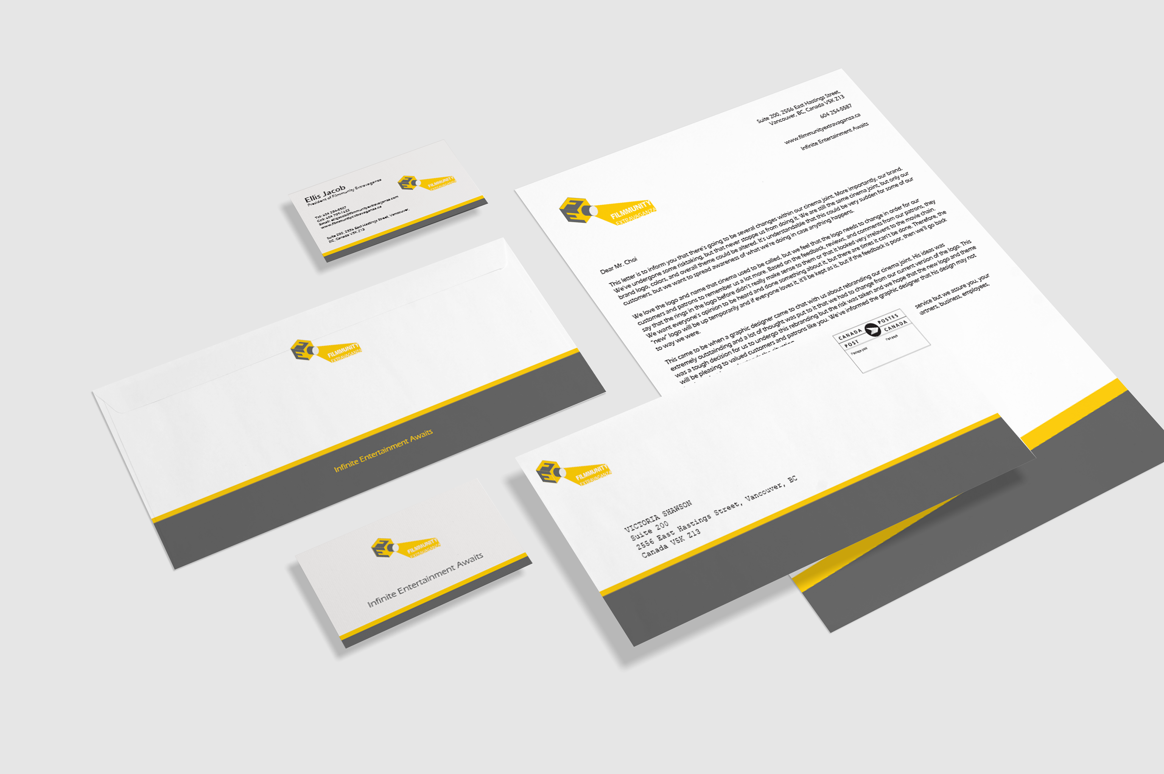
The purpose of the guidelines is to show and tell the designer or anyone how the brand is constructed, what it should be used for or on, restrictions you should be aware of, what colors to use, and how the brand would look like on business stationary. In addition, the guidelines also tell the user who they are and how it shows their personality as well as why specific key elements such as colors, theme, and the brand itself were made to be.
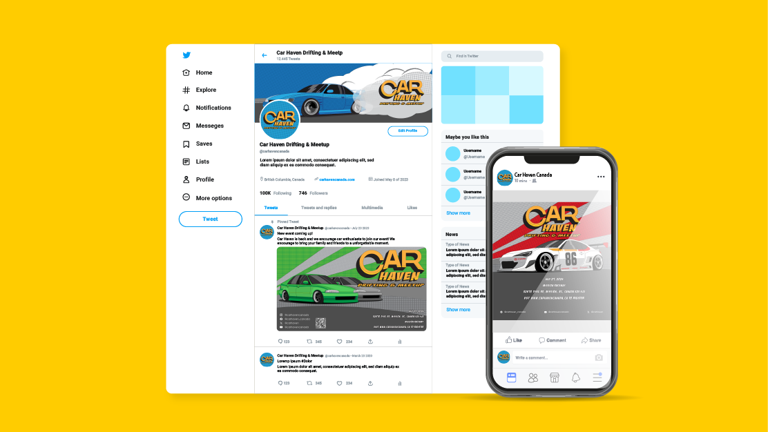
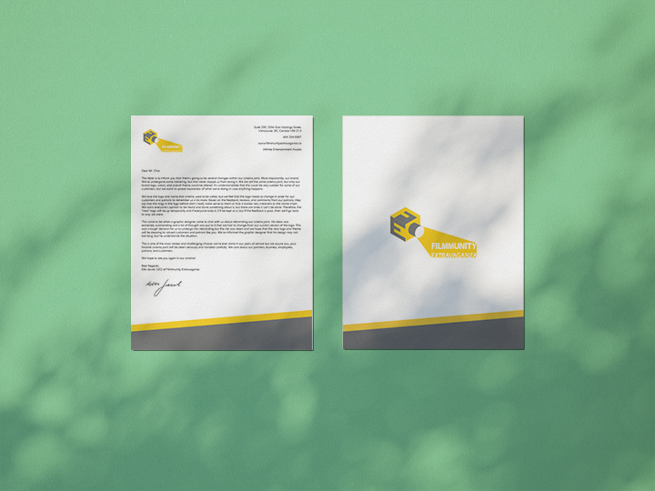
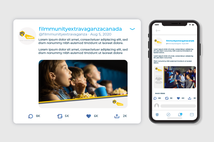
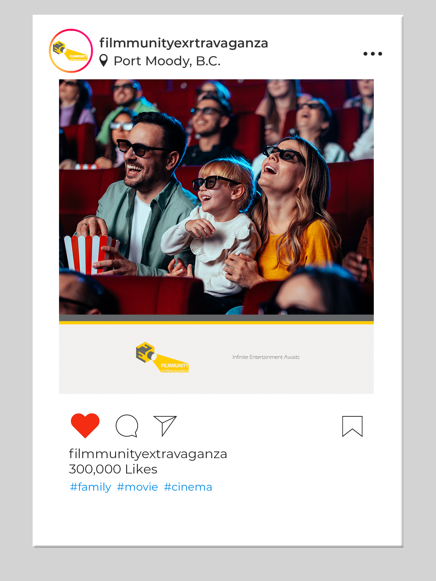
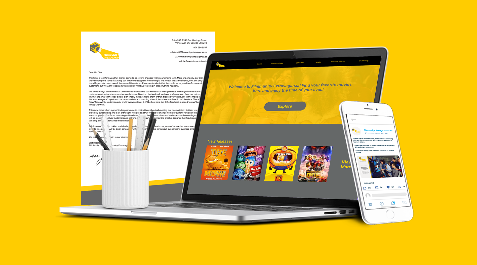
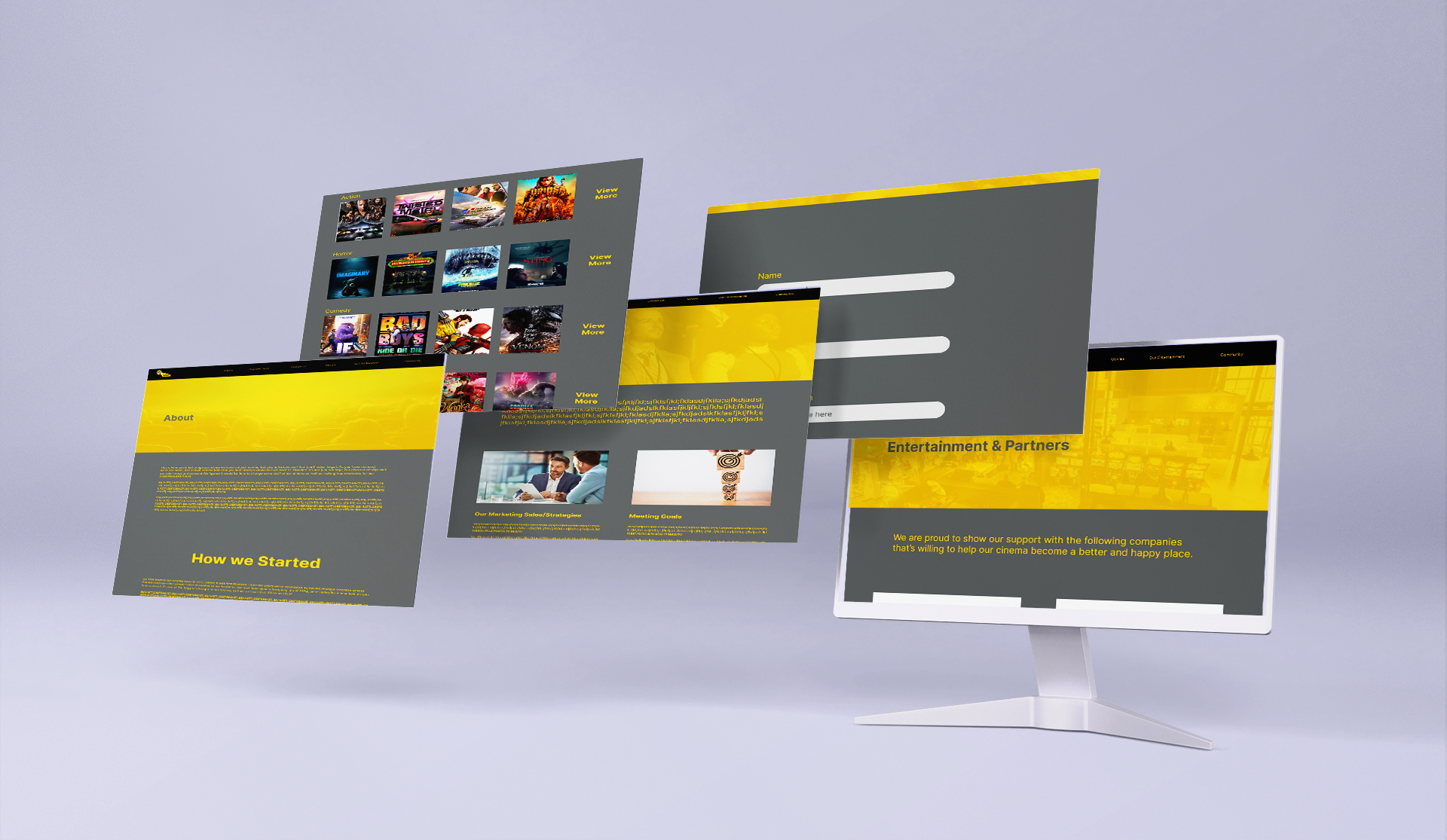
Having a wide variety of mockups and stationary is crucial and very important for rebranding so the client can know what their new redesigned brand would look like on multiple platforms and have insight of how their products/documents would look like. For social media, we all have been on our phones looking and scrolling through social media, so it would be best if the company would also post their information on social media as well, since almost everyone goes on social media.




Adobe Illustrator | Rebranding

