“Japan Legends” is a magazine about cars, related events, history, and endorsement of Japanese culture. This is to grab car enthusiasts’ attention since the magazine was made for them and the visuals and imagery will be admiring to the eye. A serif font is used to keep the mood of the retro Japanese theme since it features classic Japanese cars and round shapes show the smooth feeling Japanese culture has. A sans-serif font is also used to balance out the overall appearance along with the serif font that's used for headlines or titles. Red is the primary color used in the title to represent Japan, and the counters and eyes of some letters have been changed to the red circle from the Japan Flag to endorse its nationality.
Here are different versions of the magazine cover. This is to show the magazine's variety as well as showing off themes and topics for each magazine. In addition, the different themes/topics targets specific people from the target audience.
Creating a layout and designing the magazine is difficult in a way that I had to be very careful on how I layout my design and it was pretty challenging because I had to think about what images I'm going to use and figure out a way to make the magazine with excellent hierarchy, but overall, after peer feedback and improvements, I got the result I wanted and achieved a successful design layout.
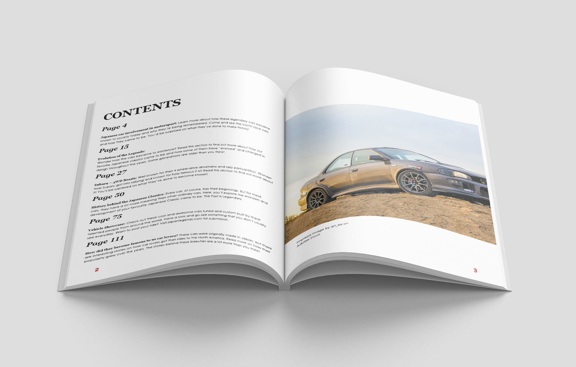
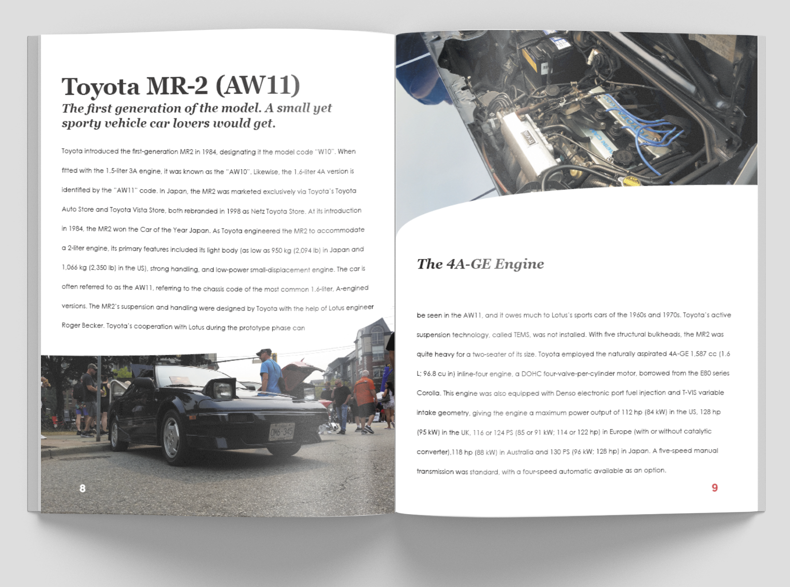
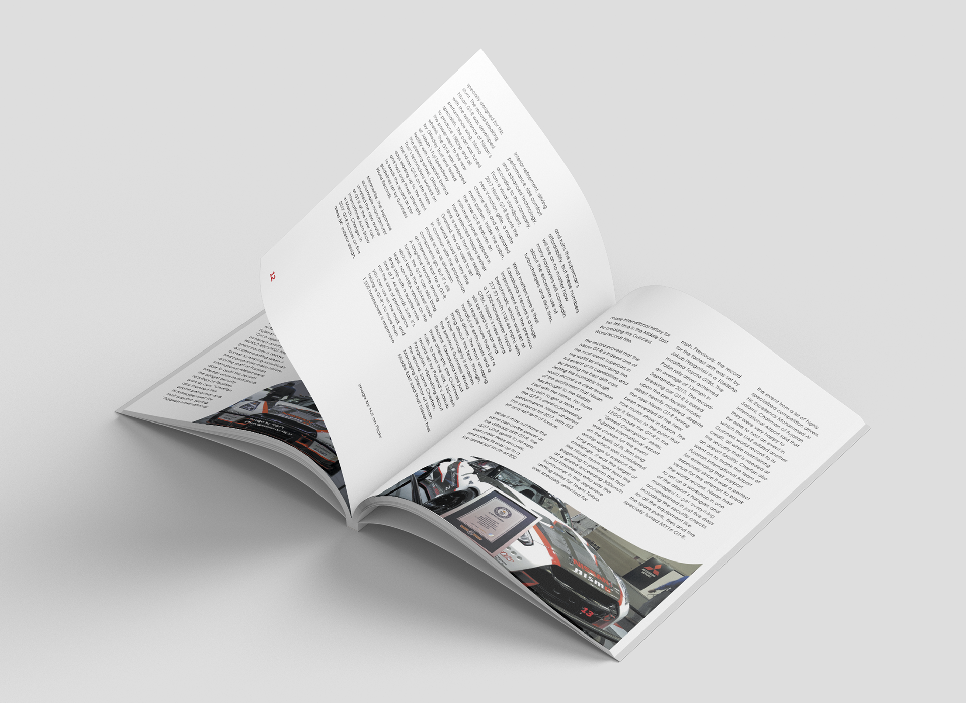
Using the pen tool in InDesign, round and curved shapes are created and used throughout the magazine spreads to make a smooth feeling and look to the magazine as well as creating a relaxing appearance to the reader's eyes. A Sans-Serif, geometric font is mainly and mostly used in the text to create the feeling of modernism to the magazine as well as a casual and simple appearance and design. The Serif typeface are only used in small amounts such as the titles and subheadings so that the magazine won't look outdated.
The magazine took a few weeks to complete and designing the ideas had to be thought carefully before proceeding. Variation of the photo placement and the number of columns the body copy makes up on each page matters because I wanted to have each page look different from each other and have design layouts inspired by existing car magazines.
InDesign | Photoshop

