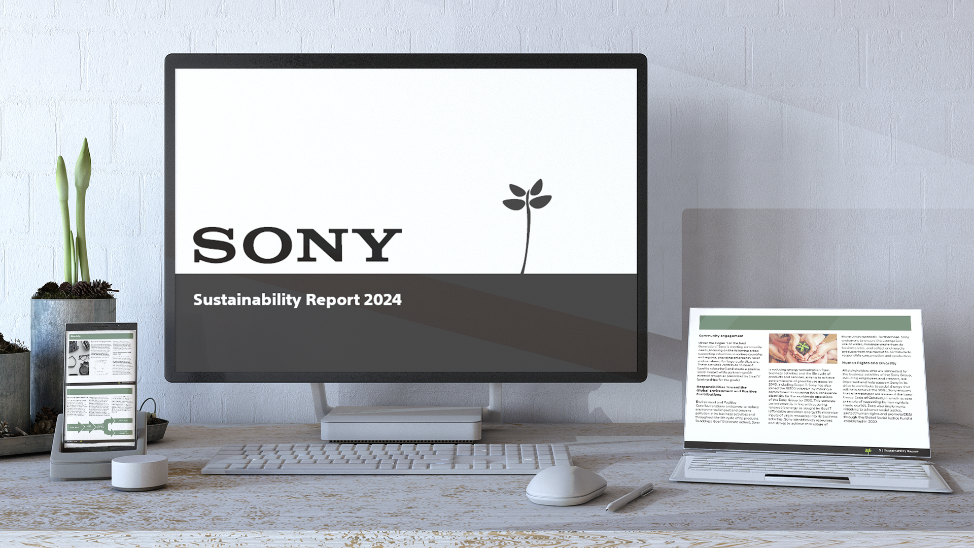
Started in 1946, SONY is a well-known electronic / technology brand that has been around for many decades. Here I’ve created a “newer” version of its sustainability report. Sustainability Reports are what companies use to state their goal to sustainability as well as what the status report is like for that year.
The main objectives of what I got out from it is that it helped me know my way around InDesign and figure out a grid system and create a design that’s pleasing to the eye. Pale Green is used throughout the design to keep the feel of 'sustainability' as well as bringing the calmness to the reader/user. The images had to be modified through Photoshop so that the resolution of each image can meet the standard requirements for online web. I'm going for a mundane yet simple design for the front cover because I feel that it doesn't need any complex designs or colors, so I kept it black and white and illustrated a small plant to ease on the eyes as well as keeping the overall theme of the company itself.
The Report will be only on screen since I feel that printing the sustainability report on paper would use too many sheets of paper and too much ink. Both reasons stated earlier can cause material / resource wastage or concerning levels of usage. In addition, because this is a sustainability report, they want people to know that they're doing everything they can to reduce their carbon footprint and reduce material wastage.


InDesign | Branding


